Brief & Background
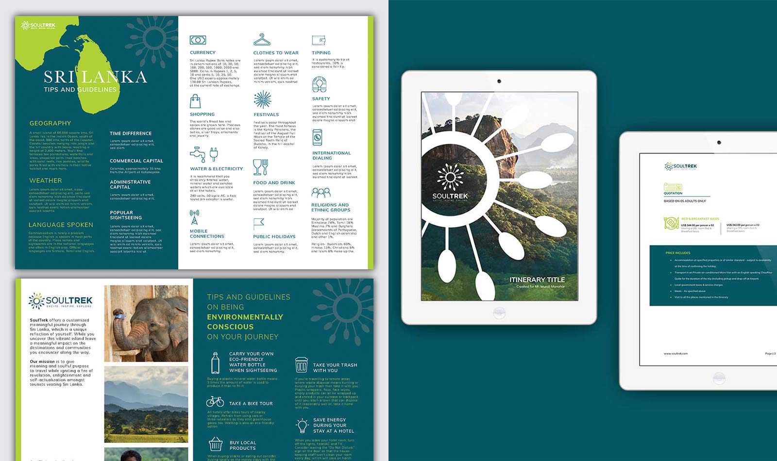
SoulTrek Travel is a destination management company that offers handcrafted journeys through Sri Lanka that encourages you to leave a meaningful impact on the destinations and communities encountered along the way. Soul + Trek = Shifting perspectives through life-enriching journeys. We were required to create an identity that encompasses the story of the brand name.
Research & insight
As part of the research, we considered the need to travel the world, the current travel trends and what consumers are looking for when they consider travelling to a destination. It was apparent that the current consumers are focused on the experience rather than the destination. It’s about authentic and unique experiences where they can grow and connect. They are also increasingly concerned about the environment and ecotourism options available to them.
When it comes to travel, the perspective is subjective. It is based on one’s own personal feeling, emotion and what they see or choose to see.
Design Approach
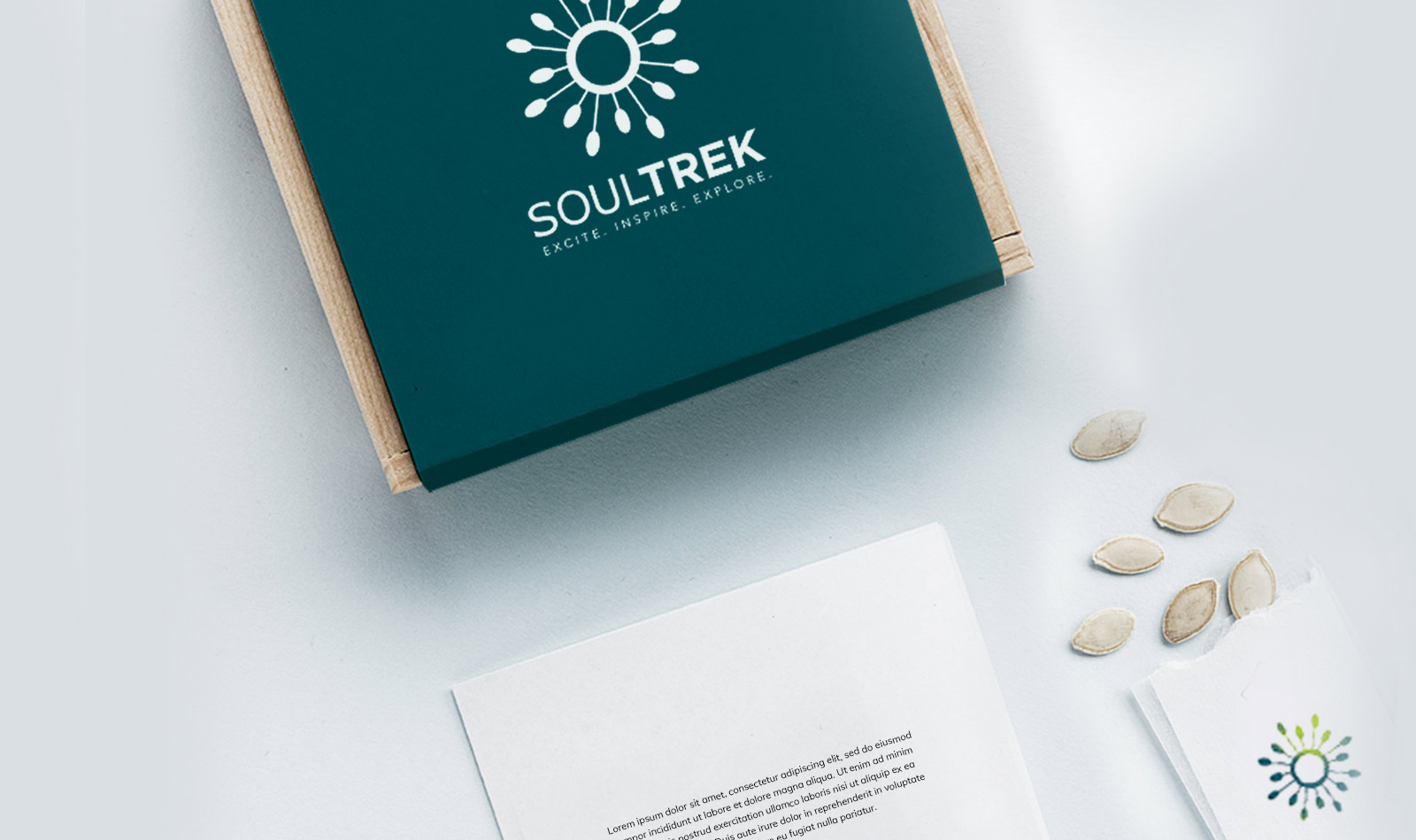
“The eyes are the window to the soul”. Sight is one of the strongest senses. The eyes are what helps you see and visually experience a journey while giving you the ability to experience something more. We took the concept of the iris and illustrated it as a symbol for the brand.
The logo was inspired by the detailing in the patterns found in an iris.These patterns can be a method of identifying ones’ personality traits which can be interpreted in many ways. Visually the pattern itself could be seen in different ways. The phrase “eyes are the window to the soul”, gives out the impression that we can see something beyond the surface. Taking this into consideration, we illustrated a symbol that represents the iris in somewhat of an abstract form, leaving it open to interpretation by the viewer.
We used colours to emphasise one of the brand’s core attributes of being environmental and socially conscious. The primary and secondary brand colour have been used to portray growth, a new perspective, and sustainability.